
Skip to content
Twenty-eight, and counting

Widgets

Each is a small thing that draws itself and answers events. The hard parts — modality, overlays, scrolling, focus order, the pointer — belong to the tree, which is why a widget stays small and why anything assembled from them behaves like the rest.

Every widget below is on this page, live. New ones arrive one at a time; the descriptions are the modules’ own.
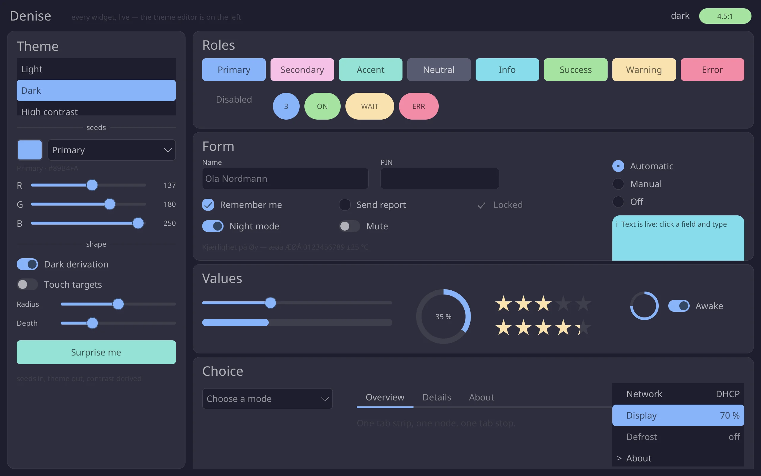
examples/gallery
Loading the toolkit (about 860 KB)…
0 frames drawn —

Label

Static text.

Not interactive, so a click falls through it to whatever is underneath — which is how a table row is assembled.

Text and input

Button

A pressable, focusable, message-emitting rectangle.

It holds a value of your type and emits it when pressed. No callbacks, anywhere.

Text and input

TextInput

A single-line editable text field.

Caret, placeholder, submit on Enter, dead keys, and selection: focus takes the whole field, a press places the caret, a second takes the word, a third takes everything. Ctrl or Option and an arrow move by word, and copy, cut and paste go through the application as the editor’s do. Deliberately absent for now: undo.

Text and input

TextArea

A multi-line text editor that edits through a document it does not own.

It asks only for the lines it is about to paint, so a file too big to load can sit behind it. Selection — a press, a word, a line — word motion, undo, paging, go-to-line, match highlighting, and bars down the side and along the bottom that are absent, not greyed, when the text fits.

Text and input

Checkbox

A box, a tick, and a boolean.

Text and input

Toggle

The same boolean as a checkbox, with a different affordance.

Text and input

RadioGroup

One choice from a few, and the keyboard rules that make it one.

Text and input

Slider

A value in a range, dragged or typed.

Text and input

Select

The closed half of a dropdown, and the four lines that open it.

The open half is a popup: a scene above the tree, which is why it can overhang everything.

Text and input

Rating

Stars, filled to a value.

Text and input

Panel

A themed rectangle: the background every other widget sits on.

Structure and navigation

Tabs

A row of labels where one is selected.

With events it becomes a document strip: close buttons, drag to reorder, double click to rename, a right-click menu and per-tab colours.

Structure and navigation

List

A vertical list of rows, one of them selected.

A selection below the fold scrolls itself into view, because scrolling is the tree’s job.

Structure and navigation

Tree

Rows at a depth, with a disclosure triangle and a hierarchy.

Structure and navigation

Collapse

A section that folds to its header, and the Accordion that makes several behave as one.

The fold animates through the same relayout path everything else uses, so stacked siblings move with it.

Structure and navigation

Divider

A line, optionally with a label in the middle.

Structure and navigation

Table

Columns of cells under a pinned header.

Data and feedback

Timeline

Events in order: a time, a disc, a connector, a label.

Data and feedback

Progress

A track and a fill. The one widget here that is purely an output.

Data and feedback

RadialProgress

A ring that fills clockwise, with room for a number in the middle.

Data and feedback

Spinner

A rotating arc, for when there is nothing to report but that something is happening.

It says that it is moving; the tree decides how often, through Ui::set_motion.

Data and feedback

Badge

A short string in a coloured pill.

Data and feedback

Alert

A coloured banner with a message.

Data and feedback

Avatar

A person, as a picture or as their initials.

Data and feedback

Image

A picture in a rectangle.

PNG, JPEG, GIF and BMP decode through denise-image into premultiplied pixels.

Pictures and media

Video

The rectangle a video plane sits in.

denise-video decodes through V4L2 onto a DRM plane, zero-copy, so the frames never pass through the rasteriser.

Pictures and media
Not widgets

What the tree owns

These are properties of the scene graph rather than things you place. That is what keeps a modal from needing flags, a drawer from needing a second surface, and an on-screen keyboard from stealing the caret out of the field it is typing into.

Modal scenes

A modal is a scene pushed over a dimmed backdrop in the same buffer. Nothing underneath needs disabling: it simply stops receiving input.

Drawers

A panel that slides in from an edge and dims what is behind it. Escape, or a press on the dim, slides it out.

Shelves

Neither modal nor dimming — which is what lets the on-screen keyboard type into the field above it without the field ever losing its caret.

Tooltips

Owned by the tree so they paint above every widget and below the pointer.

Toasts

Transient messages that fade on the tree’s own clock.

Popups

What a Select or a menu opens into, above everything, closed by Escape or a press outside.

Scrolling

Mark a node scrollable and it becomes a viewport: wheel, page keys, touch-drag, clipping and hit testing all agree, because one reflow computes them.

Focus and tab order

Tab moves through the tree in file order, and focus below the fold scrolls itself into view.

The cursor sprite

On a bare panel there is nothing else to draw a pointer, so the tree composites one — and moving it costs two sprite-sized rectangles.

examples/browser — a page’s form controls are the actual TextInput, Checkbox, RadioGroup and Select, submitting for real

Missing one? Assemble it.

There was no table widget when the record editor was written, so a row became a full-width Button with Labels on top: labels are not interactive, so a click falls through them and arrives as a selection. That is how most of the widgets you will miss get built — and some of them, like Table, later became real ones.